Formats
The ‘A3’ is frequently used for communicating complex information. They can be instrumental in structuring the information that feeds into a decision, as they make it easier for decision makers to take in all the basic facts. A good A3 demonstrates how well you understand your message, as you’ll need to be selective and clear about what you present.
Create the structure#
- Settle on your key message and questions. What do you want the decision maker to agree to? If your key message is unclear, group the intended content into boxes and ask which box you would keep if you were only allowed one. The box you choose is your main message.
- Decide the main questions you want to address. For example: Why is there a problem? What can we do about it? How should we proceed? If you don’t already have content for your A3, you can use the main questions as the basis to flesh it out.
- Think about which layout is suggested by the content. Is there a natural structure in your information? The natural flow of the content will determine the best layout. A policy cycle or annual phases might suit a circular diagram. Parallel work-streams suit a stacked image or Gantt chart. A tiered or layered approach might suit a pyramid. If setting out content in boxes, the layout should make the sequence clear.
Sketch before you etch#
- Use a whiteboard or paper to experiment with the layout and format. You may find it easier to experiment and think creatively when you have a pen in your hand.
- Test your early designs with other people. Their initial reactions can help you tell if you’re on the right track.
- As early as possible, identify any tables and graphs you’ll need. Confirming data and preparing the graphs can take longer than expected.
Influence with visual elements#
People take in and remember information better when it’s combined with images. However, try to use graphics for explaining complex ideas, rather than just decoration.
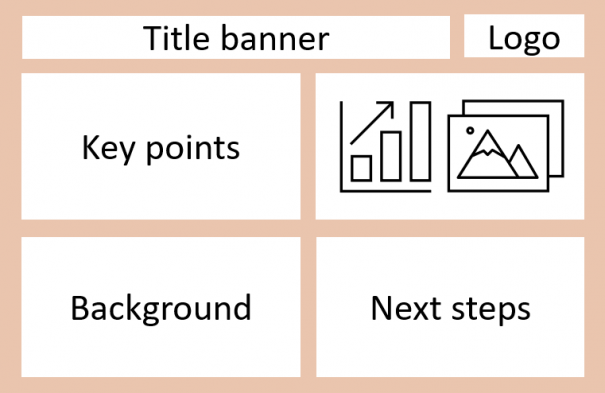
Most people read A3s from top-left to bottom-right, and generally read down the left margin when looking at a screen. They give the least amount of attention to the top-right quadrant, making it ideal for images, graphs, or other eye-catching visual content.
This example page structure shows how the A3 content can be laid out to achieve ideal reader engagement.

Consider also the following elements:
- The use of icons and symbols to highlights key points – your agency may have a range for you to use: check your agency’s style or brand guide.
- The impact of different colours – think about the mood produced by reds and oranges as opposed to blues and greens. What are your agency’s official colours?
- Alignment of lines and boxes – PowerPoint is helpful for making sure objects are aligned, but if this is done poorly, it can make the quality of your information seem less assured. Use the alignment function to make your A3s look professional.
Make sure it flows#
- Although the A3 allows you to think more creatively and visually, the information should still follow a linear sequence of headings. If the title is Heading level 1, which headings are level 2, level 3 etc? If this is clear, your message will flow more effectively. Make sure the heading levels decrease in font size as they go down.
- If your structure is reflected in the layout and formatting, your reading order will be obvious at first glance.
- Because of the visual nature of an A3, plain language is more important than ever. Keep it easy to read – use short sentences.
Graphs#
If graphs or tables will be needed, double check the data has been checked and is accurate. Make sure you choose the right type of graph for your purpose:
- Point graphs - use for displaying deviations between sets of values, time series, rankings, distributions, and scatter plot comparisons.
- Bar graphs - use for displaying time series, rankings, deviations between sets of values, and distributions.
- Line graphs - use for displaying time series, deviations between sets of values, and distributions.
- Pie graphs - avoid using pie graphs where possible. They can be difficult to interpret, especially when comparing a lot of different data.
Create the graphs in Excel and copy them over. Remember to list the items in the legend in the same order as they appear in the graph.
Tables#
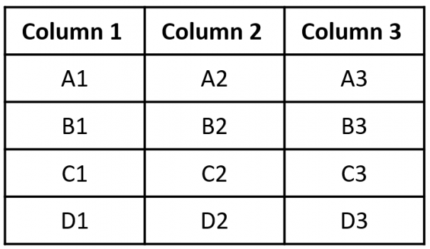
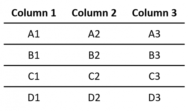
Tables are an effective tool for communicating information. Consider removing the boxes around tables to make them easier to read. Even vertical lines are often unnecessary.
Instead of this:

Try this:

Accessibility#
The New Zealand Government has committed to meeting accessibility standards. While ‘accessibility’ may have the most obvious benefits for people with visual impairments, reflecting these standards in your work will make it easier to read for everyone.
Fonts#
- Use a plain and non-decorative font. Check your organisation’s style guide or brand guide to ensure you’re using the right font.
- Your main paragraph text should be at least 12 pt. If you need to save space, you can use 11 pt font for text in tables and 10 pt font for graph labels and footnotes.
- Grey text may look softer, but it’s harder to read because the contrast is lower. Black text is the best for minimising eye strain. If your text is placed over a coloured background, use the online Contrast checker to make sure the contrast is high enough.

Formatting#
- Always use left-aligned paragraph margins. Text with justified margins is more tiring to read.
- Words in italics or capitals require more effort to read, so avoid using either for blocks of text.
- Save underlining for hyperlinks, not for emphasis.
- Don’t fill the entire background with colour. Panels of colour can be effective, but the background colour of the page should be white.
Tips#
- While Visio can be a more powerful tool, PowerPoint is more commonly used and will easier for others to edit.
- It will need to be printable, so don’t use the default widescreen layout. Select A4 or A3 as your slide size.
- Using multiple shades of one or two colours can sometimes be more effective than using a wide range of colours. Again, check your agency’s official colours.
- Try not to use questions for headings; they convey a tone of uncertainty. Turn them into statements or imperatives.
Quality assurance#
Before finishing, read it aloud.
The only way to know how your writing sounds is to read it out loud. This is always a good idea for two main reasons:
